Note-A-Rific: Graphs
Like many other topics in science, the results of the photoelectric effect can be better understood if the results are presented in a graph. It is important to be able to interpret these graphs correctly.
Here is an example of a graph of the results from a photoelectric effect apparatus:
|
|
|
|
|
|
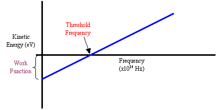
- Threshold
Frequency
The x-intercept is the threshold frequency of the material. This makes sense, since the electron will have zero kinetic energy when it has received a photon at the threshold frequency. The electron has just enough energy to be knocked off the surface, but that’s it!
- Work Function
The y-intercept is the work function of the material. For any frequency less than the threshold frequency, it’s like the electron is in a hole. As the frequency increases from zero, the electron is lifted higher out of the hole, until finally at threshold frequency it’s out. When there are no photons hitting it (frequency = 0 Hz), it is completely attached to the material.
- Planck’s Constant
If you look at the values you would use to calculate the slope of the line, you’ll notice that the “rise over run” would energy over frequency. Look at the formula E = hf and solve for energy over frequency… what do you get?
![]()
So the slope of the graph will always be Planck’s constant.
Look at the graphs on page 776 of the textbook to see examples of these points. The slope is always the same, but every material has a unique x and y-intercept. If you know any two of the three values you would be able to draw a graph for the material.
You can even relate the photoelectric effect formula to the formula for a straight line graph if it helps you remember the three points from above…
hf =
Ek + W
![]()
![]()
![]() Ek = h f – W
Ek = h f – W
y = m x + b
The y-intercept (W) will always be negative, as it takes energy added to the material to overcome the bond it has with its surface electrons.